In my post on the diminishing returns of outsourcing, I emphasized that once you’ve captured every potential savings on infrastructure, labor, overhead and other areas, the only way left to reduce costs is to reduce usage. I used the example of a call center because that is a common way organizations communicate with their members or patients. You might think efforts to reduce usage are something recent, but they’ve been around for quite some time. One way to reduce call center usage is to improve the readability and comprehension of existing communications, especially for health-related communications sent out on a regular basis, like Explanation of Benefits (EOB).
There are many reasons beyond reducing call center usage to justify redesigning documents. Maybe you want to make them attractive enough to ensure people read them. Maybe you’re looking for people to take action – like pay a bill or address specific behaviors.
This post’s purpose is to highlight an example of a common member communication and how the payer redesigned it to make it more useful to their members.
Remember the mainframe!
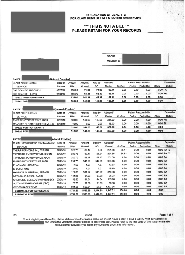
In one of my first Flashback Friday posts, I wrote about transactional communication (used for billing) and other communications with a high usage of variable data. The data used in the early days of these documents was originally stored and sent from mainframe computers. The early versions of these transactional communications had strict limitations on formatting and fonts because they were originally created for line printers. Once production level digital printers took over the market, most companies didn’t do much to improve these documents. They just printed them “as is” on the newer digital technology. As a result, they continued to be hard to read and understand. Look at the following image of an EOB page:

You might think this is something from the 1970s, but this was sent to members in 2010! There was a high level of dissatisfaction with this document and members were consistently contacting the call center with questions on claims as well as payments. Frankly, this is a great example of how call centers predicted times of high call volume. They knew they’d be flooded with members’ calls within days of a bulk mailing.
We can do better
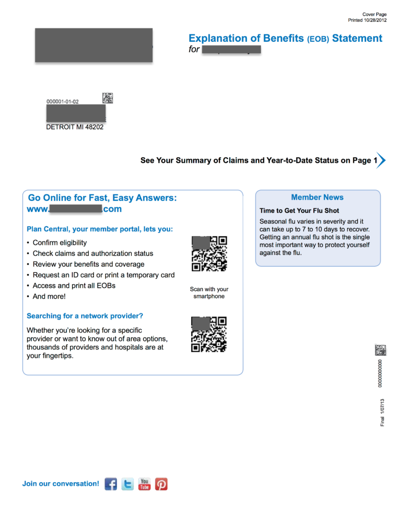
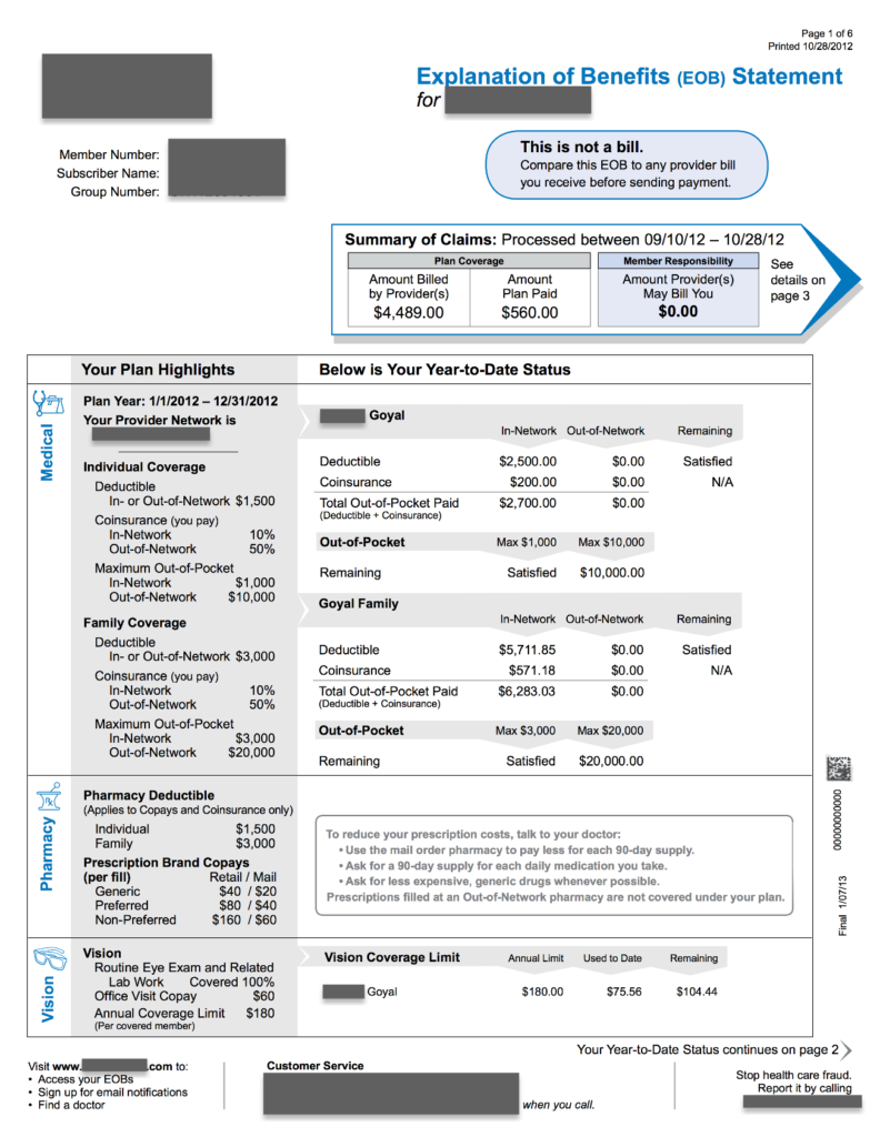
Member dissatisfaction, and the growing pressure to reduce call center spend, drove companies to explore ways to redesign their documents. Whole consulting offerings were created in this space, using behavioral science to examine how to present information in ways that would result in increased readability and comprehension. Common tools were information chunking, effective use of color, mixing graphic and textual information, as well as visual cues to direct attention. The document above was redesigned to look like the following (please note: this is a mockup).

Cover Page 
Page 1
Notice all important messages and numbers are now in the blue shaded sections. Some additional key improvements on each page are:
Cover Page:
- Easy access to member portal or network provider database by scanning QR code.
- Rounded corner Member News section to deliver personalized messaging to groups or even individual patients.
- Visual cues to find your Summary of Claims and YTD status.
- Built-in social media links for members who download the EOB from their web portal.
Page 1:
- Effective chunking of information and message highlights.
- Rounded corner shape to highlight the EOB is not a bill. Has instructions on use.
- Summary of Claims placed at the top with amount owed highlighted. Arrow pointing to “page 3” for details.
- Color graphics in breakout sections for medical, pharmacy and vision. Summary of coverage and matching activity to the right of each section. Subtle use of arrow imaging to help reader connect with the right information.
- Educational verbiage in Pharmacy section when there is no activity for the month.
- Messaging and arrow point member to page for continuation of summary.
- Bottom of page has information on what you can do at the website, how to access customer services, and how to report fraud.
Many of these improvements were added specifically to address the reasons members contacted the call center. How much do I owe? Is this a bill? What is my deductible? Have I met my deductible? Call centers are very good at documenting the reasons why, and the number of calls people make, regarding specific documents. These improvements enhanced the health literacy of the members which meant fewer calls to the call center. Everyone wins!
Improve process or reduce usage?
There is an interesting parallel between this example of call center efficiency and our current dilemma around treating chronically ill patient populations. And it revolves around the primary focus for reducing cost. Do you focus on improving process efficiency or reducing usage?
Most every company typically focuses on process improvement to reduce cost. They reduce labor cost, automate steps, source lower cost components and more. But as I mentioned in my previous post on the diminishing returns of outsourcing, you reach a point where little to no savings are left in process improvement. You must reduce usage. Redesigning the key communications driving call center activity does this by improving health literacy. No need to contact the call center – because the member already has the knowledge necessary to manage their EOB claim activity.
Think about our current approach to treating chronic illness. A great deal of it attempts to reduce cost through process improvement: lower cost personnel, telemedicine, testing automation via IoT devices and more. Yet improving health literacy has been shown to reduce medication errors, improve patients’ ability to follow instructions and successfully navigate the healthcare system, and lower the incidence of hospitalization.
The point is effective communications are the real answer in lowering usage and cost in health systems. Call centers reduced call activity and cost by creating communications that increased comprehension and readability. We should attempt to reduce the clinical activity and cost of chronically ill patient populations by doing the same thing.
More to come
I started with this example of document redesign because it does a good job of illustrating how communications can reduce usage and cost. Yet there are related fields of persuasion theory, or the use of visuals to stimulate persuasion, that offer additional value in improving health literacy in chronically ill patient populations. I’ll examine these topics in future posts.
Post photo created by jannoon028 – www.freepik.com


No Comments